Wednesday, February 28, 2007

New color palate/fonts assignment

The image I chose to select a color scheme from is of a thoughtful Hokie Bird. Some people may say that a thoughtful Hokie is an oxymoron, but I believe that I am one. In the image, the Hokie Bird wears his team colors (Burnt Orange and Chicago Maroon) on his sleeve - actually, his face. The bright orange conveys energy, passion and a will to achieve/earn a victory. The Maroon conveys courage, bravery, heroism and strength. I want to exhibit all theses attributes through my work, along with the thoughtfulness of the Hokie Bird so my energy, passion and courage do not get the best of me. In my cropping from the image, I also snipped a section of the Hokie Bird's eye. I did this mainly so I could use some black or white text if necessary in my blog. I have absolutely no experience with html or css before starting this class, but I began playing around with the codes to change around my colors and kind of taught myself a few things...including how to get the VT logo going across the top of my page!

For the second part of the assignment, I chose BernhardMod BT as the font for my main header and Staccato222 BT for my description. I love the stems on BernhardMod BT and how they move from being very thin to very thick, especially on the capital "T." It certainly is a far cry from the original bitmap fonts described by Kuo. The "T" reminds me of a cross symbol or sword handle that you'd see associated with The Crusades...which seems to fit perfectly with the theme of courage, heroism and bravery coming from the maroon coloring. As for the Staccato222 BT, I felt it added a nice contrast to the main header and the semi-cursive writing fit with it being a description. When I designed at newspapers, we would often make the main headline something standard like Franklin Gothic Book and set it off with a header in a font like Staccato222 BT. I decided to center the header because it looked kind of goofy on the left, but I struggle to find the proper sizes for them. I eventually settled on something that I think works, but then had to go through and change all my blog entry fonts and sizes to match up a little better. Needless to say it was a full day of trial and error to remake my blog, and it wasn't until I was almost finished that I found some pretty helpful instructions in the blogger help forum of all places. It's good reading for anyone not familiar with HTML and CSS. This site also has a lot of helpful tips for us rookies.

By the way, I know I'm really early with this assignment, but I'm getting married March 10 and going on my honeymoon immediately afterwards, so I don't expect to be blogging too much over that span. Hope everyone likes the Hokie motif.

Are we getting dumber?

I love trivia quizzes, so of course I was excited when the new show, "Are You Smarter Than a 5th Grader" began being produced. I haven't gotten to see it yet, but I have it recorded on DVR, so don't tell me who our first president was or any such knowledge that I may need. I'm looking forward to a fun time. In the meantime, I saw this hilarious video on YouTube that combines the joy of a trivia contest with the pleasure of laughing at stupid people. Using man-on-the-street interviews, the reporter begins by asking Americans to name a country that starts with "U." Check it out. It would be interesting, or scary, if the reporter would just ask these folks if they vote.

Sunday, February 25, 2007

Web site critique


Hillman Curtis, Inc.

Description

Hillman Curtis, Inc., is a company that specializes in new media design, specifically Flash advertisements and images for Web sites. The purpose of its Web site, hillmancurtis.com, is to attract potential clients, though the company does not explicitly state that.

The way Hillman Curtis, or actually hillmancurtis, goes about attracting clients is by informing them of the creative elements it can bring to a Web site. The company’s site itself is done entirely in a blue-purple background and is rather sparse with some simple links to company/client information across the top, an object that looks something like a digital heart with a search box in the top left and five descriptive links at the center/bottom to videos/books produced by Hillman Curtis. The fifth descriptive link and a tag that says “Powered by Media Temple” are all that appear below the fold. The focal point of the homepage is a large square in the center that immediately attracts viewers because of its different, dark color and its size in relation to the page’s other elements. The square runs a Flash video on a loop.

The video begins with the image of a little girl, looking off screen to the right. The image is so clear and precise that it gives the impression of a photograph. It is not until about five seconds in, when the girl blinks, that the viewer realizes it is an extremely high-quality video. The video, which has no sound, proceeds to show a number of people’s faces as they hold still and occasionally blink.

Analysis

All the elements on the Hillman Curtis Web site are understated in order to draw attention to the large Flash video in the center. The links are all written in a very small font size and in colors such as pale white, grey, pale green, pale orange and dark blue. There are small bubbles beside the descriptive links, and a red “Y” for Yahoo does tend to stand out a little. There is just one color, however, that really jumps out, a fluorescent yellow that is used for the company name over the heart image in the top left corner.

There are no real patterns to speak of other than the way the links are positioned in four short, spaced out columns at the top of the page. The page overall has a square shape thanks to the large, square Flash video box and the grey corner formed at the top left. The clean, empty look of the page makes your eye continue to focus on the Flash video, the one bright and changing element. The descriptive links directly below the video tend to be ignored because of its overwhelming presence.

Interpretation

This Web site does have a serious leaning towards it, but the video immediately caught my attention and amazed me. Using human faces forms a natural emotional connection, and the video does an especially good job in drawing viewers in by beginning with a young girl’s face. My first inclination was that the center box was just a photograph of a girl, and I was about to close the browser window when she blinked. I was shocked, and I had to sit and watch the entire video to see what was going on.

The appeal of a human face is universal. The faces have no language and no sound, and as long as you have the ability to see, you can be touched emotionally by such a video. It reminds me of some highly artistic photographic portraits in a museum, but the fact that they are moving and breathing makes it even more interesting.

Judgement

I believe Hillman Curtis’ Web site is highly effective in pushing potential clients to find out more about the company and its work. The video is so clear and amazing, like very few other videos on the Internet, that it drives viewers to click on the company links at the top of the page. In the age of grainy YouTube videos and Flash videos on sites like ESPN.com that are the size of postage stamps, Hillman Curtis’ technology really stands out. If this seemingly underwhelming Web site can get me, the quintessential short-attention span viewer, to stop and watch, then it is sure to attract many clients.

Monday, February 19, 2007

Posterized!

I used to feel sorry for Shawn Bradley. Sure he was 7-foot-6 and a multi-millionaire after 11 years in the NBA, but he was also the most-posterized player in history. The fact that he was a tall, white stiff made him the most-appealing target to dunk on ever. So many players dunked on Bradley, including fellow sticks Gheorghe Muresan and Yao Ming, that SportsCenter even had a Top 10 list of dunks on him. But after seeing Dwyane Wade's new Gatorade commercial during the All-Star Game (sorry no link), I don't pity Bradley any more. Bradley, who retired two years ago, took a paycheck to let Wade dunk on him during the commercial. Now I don't even feel sorry for Tracy McGrady's playoff throwdown or Mark Davis bodyslamming and kicking him. Show some pride Shawn!

Sunday, February 18, 2007

Designing a better desktop computer


I saw a story on CNN about a company that is producing custom desktop computers that aren't just the standard box design. Suissa Computers has the goal of creating luxury systems that can fit into the interior design scheme of a luxury living room. They're a little out of my price range, but I think they fit in with aspects of this class.

Thursday, February 8, 2007

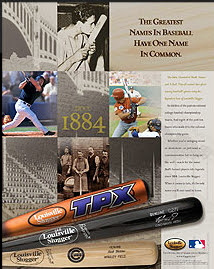
Branded bats


  1. Brand: Louisville Slugger. The Hillerich & Bradsby Co. essentially began in 1884 when 17-year-old Bud Hillerich slipped away from work to watch Louisville’s major-league team play. The Louisville Eclipse’s star, Pete Browning, broke his bat during the game, and Hillerich invited the player back to his father’s woodworking shop to make him a new one. Browning had three hits the next day and the reputation Hillerich’s specially made bats, which were dubbed Louisville Sluggers, spread quickly. Today, Louisville Sluggers are used by 65 percent of major leaguers. In the 1970s and 80s, H&B nearly went out of business when little leaguers, softballers, and college players began using aluminum bats. Today, metal bats are H&B’s biggest moneymakers. The company also sells baseball and softball gloves, hockey equipment and PowerBilt golf equipment. The Hillerich family and H&B employees own the company.
  2. Image: History and specially tailored bats. H&B tries to predominantly feature two images of its Louisville Slugger brand: The historical aspect of the bats and the fact that the bats are specially tailored to each individual customer. Not only is there a Louisville Slugger Museum, but the company’s literature always refers to the past greats like Ted Williams, Babe Ruth and Hank Aaron, who used Louisville Sluggers. H&B also trumpets the fact that for hundreds of years, it kept cards on every player to note the weight, length, wood and cut of the bats he liked.
  3. Message audiences: Major leaguers, fans, metal-bat users. The Louisville Slugger brand tries to connect with a number of different audiences. Major league players are still one of H&B’s biggest customer bases, so the company tries to play up the individually made aspect of the bats as well as the fact that great players throughout history have used them. Fans are told about the former greats and offered the opportunity to have their own names etched onto a personalized Louisville Slugger. Metal-bat users, meanwhile, are given charts and instructions on how to select a bat that will perfectly fit their swing.
  4. Louisville Slugger’s greatest bit of branding is on every one of its bats. The logo with the familiar oval surrounding “Louisville Slugger” is burned onto every wooden bat and painted on every metal one. This image is frequently used along with the burned-in signature of former and current players to convey the historical aspect. And though the metal bats may not have the same historical appeal, they are given historical appeal in ads by relating them to college baseball championships and dynasties.
  5. This message is strongly related to the culture of baseball, and somewhat America. People in Japan, for example, can relate to the brand if they follow baseball, but those not familiar with the sport would not care if Eric Gagne plays with a Louisville Slugger.